Chambéry, 4 October 2019
PEV is dead, please welcome PEV2!
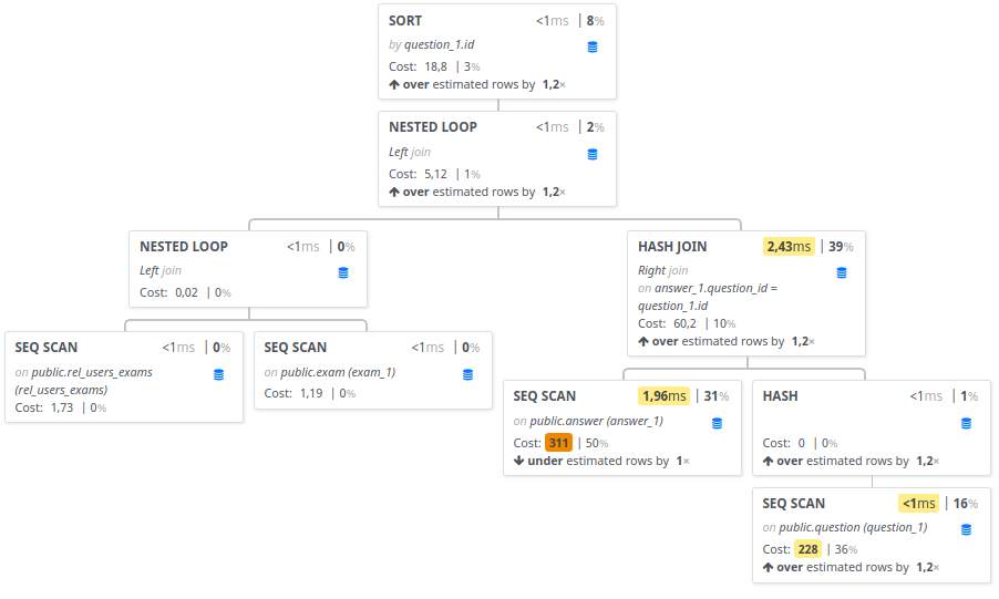
PEV2 is a graphical visualization tool to understand PostgreSQL execution plans.


Why PEV2?
You probably already know the simple yet excellent Depesz. You may also have heard about PEV which is popular as well and it’s deserved.
The latter is a really great tool in my opinion but unfortunately it hasn’t been actively maintained for more than 3 years now.
While searching for a javascript library to display an execution plan into a monitoring tool (temBoard), I wanted to check if PEV could make a good candidate. It was unfortunately impossible to use it as is. It seemed abandoned and didn’t fully match my needs. Thus I quickly decided to fork it. With great and quick success, given the fact that it was really well written. Kudos to its author.
The result can be seen at explain.dalibo.com.
What’s Inside?
To make it very quick, the new project is written using webpack, VueJS, Typescript, Bootstrap.
Why VueJS? Well, it’s just a matter of personal taste.
PEV2 Can Parse TEXT Format!
Hell Yeah!
Though still to be improved, PEV2 is able to parse an execution plan in the
default format returned by EXPLAIN (ie. text).
Insights
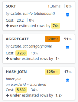
Instead of only showing the slowest, costliest or largest node. I decided to imitate what Depesz does by highlighting the most relevant values for duration, cost and row estimation factor using thresholds and a color palette going from yellow to red .

Vue Orientation
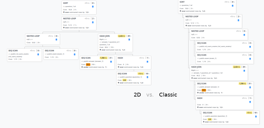
With PEV2, you can choose the way the graph is displayed: 2D or classic. This is your preference.

To be continued…
That’s already a lot. But stay tuned. There will be other posts to go into more details.
Reminder: you can already play with it on explain.dalibo.com.
Want to contribute or built it for your own needs? The code is free to use and is on github.
If you use PEV2, please let us know how you like it at pgira or at dalibo. We are open to any kind of feedback.
